The blog is one of the most popular sources of getting information and solving problems. The new trend of creating video content has seen a good boom, yet it fails to overcome the popularity of blogs. People all over the world have seen the popularity and reach of blogs. Therefore, there has been an incline in the number of bloggers.
This makes the blogging market highly competitive and thus makes a blogger’s job even tougher than it already was. He has to take care of several factors that could increase or decrease his site’s ranking. And he has to handle while everyone is trying to be better than the other guy.
So the situation can be handled by writing good content, right? Wrong. Though content indeed plays the most important role in ensuring the success of a blog, yet the design and layout of your blog also play a very significant role.
Design is where a reader judges the site and finally decides if the content will be worth reading. It helps bloggers show professionalism and quality to their readers. No amount of good content will yield good revenue unless it is presented in a highly sophisticated manner.
It is the same case as in your food; when you ask for a dish at the restaurant, no matter how high you may have heard of the dish, you will judge it on its looks first before eating it. So, design and structure are treated with high regard when we talk about professional blogging.
We will look into the practices which will ensure that your blog site has a good design and layout. This design guide will help you optimize your site in the best possible way.
1.Know Your Grid Structure
Firstly, know what your grid system is and how it can be made better for the readers. Various writers and editors have been focusing on giving the readers the best possible readability for years. The grid system has been applied to any piece of material which has the purpose of providing readable content to its audience.
For instance, newspapers, magazines, brochures, pamphlets, books all follow a grid pattern that is easy to read the content. As blogging also promises the same written content, it is required to present it in a structure people are more comfortable with.
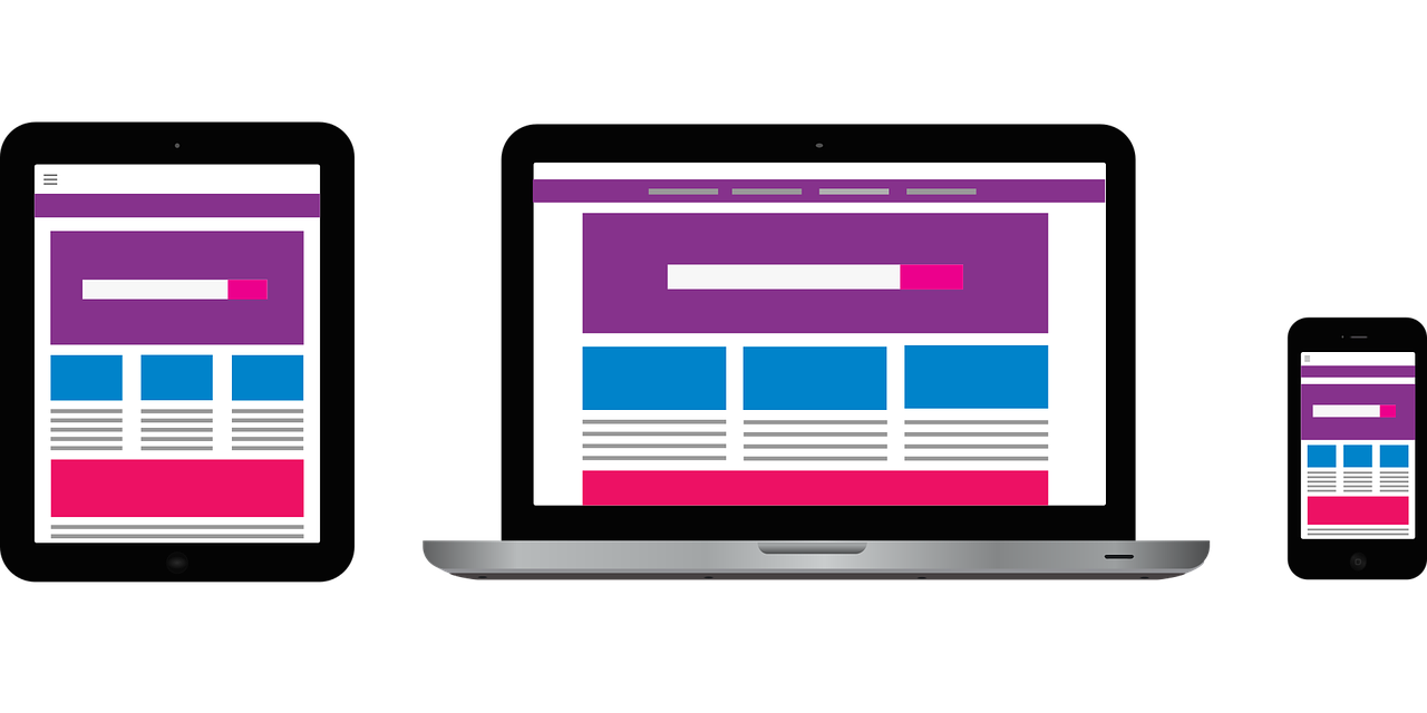
Now, there are several devices on which users can read the blogs. Therefore, the grid system gives them a more consistent experience throughout all the types and sizes of screens of such devices.
Focus on keeping your grid size small and compact, which will make your long-form posts easily readable. A large grid structure will make the readers lose focus and will make your content look too spread out.
A good HD display of 1920X1080p is quite common these days, which should help you decide the width of your grid layout. Therefore, your width should also be near the 1080p bracket to get optimum readability on all the devices. Even if you take old devices into account, you will still find this width range to work best for almost all screens.
This grid system also makes sure that all the media content, headings, paragraphs, etc. have enough space between them to look clean and presentable.
2. User-Friendly Navigation
A website is of no use if the user cannot go through the whole website with ease. A good navigation system will ensure that all your content is readily accessible and findable to readers. With bad navigation, you may very well just pray for each of your blogs to reach the public.

Menus should be placed at the top or side of the website, which should always provide easy access to content. A person should get to see all the parts of the website in one place. Placing several links to the webpages at different places of the whole page will only look unorganized.
The about page, community page, recent posts page, etc. should all be placed in one place and all together. The readers should also not feel like they are missing out on the whole content of the website. Moreover, you can place links to your related blogs at the end of the blogs. As a result, you will get to see more traffic on all of your blogs.
Readers will also appreciate this as they may find more info on the subject in the links you provide.
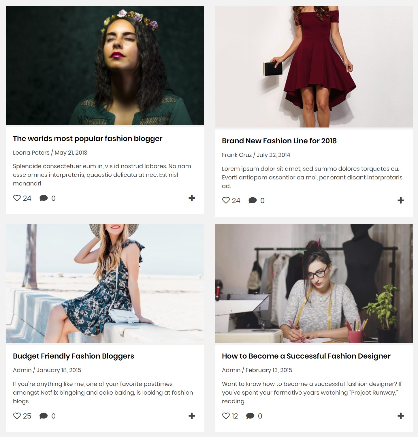
3. Blog Card Layout
Your job is to write consistently with a good heading and structure while also maintaining the quality of the content. Each blog will have some features to it which a person would be searching for. A heading alone cannot help the person decide whether to click on the blog as he may require more info. Therefore, you can use a blog card layout for your blogs to give a more presentable preview to the visitors.
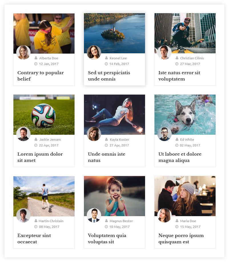
This type of layout has gained massive popularity all over the Internet. You may already be having several blogs published, so this layout helps you to keep track of them. Moreover, you get to present the key points and flashy titles with images that will attract more readers.
The visually appealing cards will definitely bring a better structure and design to your blog site. It can and should include the following:
- Blog Title
- Featured Image
- An Excerpt from the Blog
- Author Name
- Date of Publish
- Category
- Share Button
All the elements will give the readers a good idea of what to expect from your blog. As a result, you will find more people are reading your blogs as compared to earlier.
If you have multiple bloggers or contributors, then the readers can easily check the author’s name in a card layout. Similarly, the publishing date helps a reader in knowing if the blog is new or an old one. As a result, he can organize his reading time accordingly. The brief intro or excerpt can help him know what tone or direction the blog might be going towards.
4. Featured Blogs
There are many blogs that do better than others, and this is the case with every blogger. No matter how professional one is, it is not possible to get the best traffic in every blog you write. Therefore, we can distinguish your blogs and pick out the best ones with the most readers and conversions.
These blogs could be on trending topics, or you could have included unique information in the blog. In addition, these blogs may contain good keywords and maybe optimized well for search engines. As a result, you get a good number of blogs like these, which you can use to show first to the visitors.
Appearance and quality speak for themselves, and your goal with this is the same. In other words, you should use such blogs as featured blogs on the front page of your blog site. These blogs will help show the visitors your best work and give them an idea about your style of writing.
Moreover, it will give them your opinion on the niche you are writing about. Similarly, they can see the products you are recommending in such blogs, which makes your job easier.
But the question arises, how will the readers know if these blogs are the best ones? This can be done by giving the blogs a specific tag to them, which will give them the reason behind featuring the specific blog. For instance, ‘Top Rated Blogs’, ‘Most Viewed Blogs’, ‘Reader’s favorite’ etc. are good tags to use, which a reader can easily understand and then decide to click on these blogs.
You can easily fetch all the blogs under these tags to the front page and feature them to your readers.
5. Good Use of Images
These days, people usually skim through the whole blog post. People get to the best part of the most useful part of the blog because reading could get monotonous. The ones who do read the whole thing usually want something to relate to, which complements the written content. The same goes for the ones who skim through the article. This is because there are more attractive options to get information from these days.
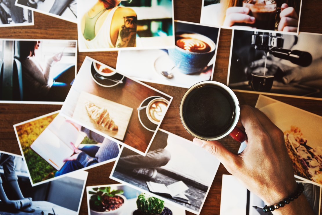
The media content has been booming and will continue to boom as it has more attracting power. Therefore, it has become a common practice to include media like images in your blogs. The featured image, among other images, has a more unique and specific role to it. In other words, the featured image presents the blog with a visual aid so that readers can imagine what the blog could be containing.
It helps give gravity to the topic of the blog, and readers can usually relate to the images. But make sure that your featured image is not too large as it can bring out problems for the readers. It should be of high quality, and it should be large enough to enjoy the details of the image. Above all else, it should be relevant to the topic and should not be a generic one.
On the other hand, the blog should have enough images other than the featured image so that people can keep on relating the content with the images. It helps them get rest from the whole reading aspect and lets them enjoy a break with a good quality image. In addition, it lets them think about the topic and keeps them indulged in the subject.
Long blogs could also seem shorter and fun when you play around with the image placement layout.
6. Formatting Structure
Your blogs can have great info in them, and they could also be well optimized, but one aspect many fail to see is the formatting of the text in the blog. Readers should be able to read with ease; this is the simple motive towards writing, editing, and formatting. Therefore, stay away from short and absurd font styles, which could hamper the readability of the blog’s content.
A user would not want to zoom into the browser just to read your blog. The concept of ease of reading fails if you put your font size at 11pts or fewer. Many do use such small font sizes just to give the illusion that the blog is short and a quick read.
This will do more harm than good to your blog design and reputation. Moreover, people go with a font style like “Blackadder ITC” or “Calibri Light,” which strains your eyes if you try to focus.
Try to keep it simple and go with a good font size of 18pts for normal text and around 22pts – 25pts for headings and subheadings. These usually work for all types of screens and give the users an easy reading experience.
A reader has time for 28% of the words when he reads a blog, and with a bad text format, that number goes down even further. Therefore, it becomes very crucial that you focus on making your content as easy to read as possible.
This study shows how the pattern of F Reading still follows even in mobile phones. So, you could write catchy and useful words which a reader could be searching for in the right places.
7. Precise and Purposeful Subheadings
People do not give a lot of time to read the whole blog. It is just not possible for them, and they usually don’t want to waste their time reading something which is not useful to them.
Therefore, we use subheadings like H2, H3, and H4 to bifurcate content into small chunks further. A subheading should have good descriptive words regarding the subtopic so that readers can search through the blog with ease. In addition, it is a great way to help you organize the structure of the blog.
Furthermore, there is no risk of important information being buried deep into the pile of content. It can be seen by the readers while also saving their time on reading on the matter they don’t need.
Moreover, people who may be unaware of some elements of the topic could get great help when they see a descriptive subheading. A good subheading should not include difficult words or unpopular phrases because it will break the main purpose of it.
Avoid using generic headings to bifurcate your content just for the sake of bifurcating. For instance, Part 1, Description, Invoice all such one-word headings will not help anyone in finding the correct info.
8. Give Freedom to Share on all Platforms and Devices
The increase in the number of mobile users has made bloggers change their format of blogs. So, many bloggers started taking out elements from their blogs, and one of them was social share buttons.
Sharing is one of the key factors in a blog’s success. There are dozens of social media platforms that one could use to advertise one’s blogs. Sharing has become a necessity these days, and if you are not doing anything about it, then you are missing out on a huge audience.
People want to share what they read, and they want to discuss the same, so let them share. You can include a share button at the bottom of the screen, as many will share after they are finished reading. You can also use a single button that will pop up all the platforms where you can share the blog.
In addition, make sure that social sites are relevant and popular sharing sites. A site link which has no users will only take up space where any other site could have been.
9. Right Way to Place Lead Magnets
Increasing your email list is a great way to help you climb the ladder of success in blogging. Also, a blog’s conversion rate helps the blogger in earning revenue. But how will one make it possible? The answer is lead magnets, but you may think they are an annoyance to readers and should be removed for better results.
This is not the case, as many may be thinking. There should be a specific style of adding these so that it makes users subscribe instead of running away from them.
Ideally, you want to provide the audience something useful in return for giving their contact info. In other words, it should look like a good offer to them. You can add a pop-up with a timer so that it lets the person first enjoy the content, and then he would want to look into the product you are presenting. This method works best as they have already shown interest in your content, and they may also want to get what you are offering.
Moreover, the lead magnet should be simple and concise with important info. It should clearly state the resources you will receive and why is it helpful for you.
Multiple pop-ups and constant reminders will make the readers go away from the site, so make the offer once or twice.
10. Author’s Description
People want to know who wrote the blog, and this is essential for building trust between the blogger and his audience. It has become a common practice to give a brief description of the author at the end of each blog. As a result, it provides the readers with the answer to who wrote it, and they can even search for more blogs by that author.
If your blog site has several bloggers, then it is a good practice to have a separate page about the authors. It also helps the readers in searching for their favorite bloggers and their work.
Customizing the Blog Layout Easily
Now since you know all the things that can make a blog layout look better, we can go ahead and see how you can implement this on your website easily. There are many alterations listed above, and if you went ahead and started looking for plugins that can do respective tasks, your website will be bloated with unnecessary plugins.
Although there are loads of tasks and things listed above, you can make all these changes easily and implement them with the Blog Designer plugin. This amazing plugin will allow you to customize your blog pages’ layout and customize them further easily from the customization options.

You can make your blog layout look exactly the way you want, and you can do all of this easily without touching a single line of code. If you want to learn more about the Blog Designer plugin, you can check here.
Moreover, since the Blog Designer plugin comes with highly optimized blog page layouts, you can directly import the one you like, and you do not even need to customize the layouts to meet the conditions mentioned above. Every layout of Blog Designer is highly optimized for the best and will definitely have all the things to make a perfect blog layout.
Check out the demos of the templates that you can use for your blog page with the Blog Designer plugin. And, If you want a template specifically in a timeline format then you can try the WP Timeline Designer Pro WordPress plugin. You can showcase the life story, event summary timeline, author biography, content timeline, and many more.
Conclusion
Blogging is about much more than just writing. It has become a source of all kinds of information. Moreover, it has become a community that gets to share and talk about their love interests.
The market is filled with several bloggers, and thus, the need to be better than the others arise. Therefore, one does everything that can help one come out at the top of the blogging industry.
Content has the most potential to bring in an audience and make a successful blogging site, but the visual and design aspect plays an equally important role in it.
Each of the plugins, links, share buttons, menus, navigation have a purpose of filling, and with the right amount of effort and time, a blog site can look professional and can resonate with a brand name for itself.
Follow the methods described above, and you will start to see the change in the response you get from your community. Also, do let me know what you think about the advice and how would you implement them in your blog.
Thanks for your tips.
I agree that Blog Layout also plays a key role to improve the site traffic and to better user experience, along with content. The Blog Designer plugin is a great solution to customize the layout design. I think I will try it.